It is no secret that colour is about far more than just what looks great – although of course this is important. In the retail industry, colour means a great deal as far as attracting customers, and your custom creative packaging should reflect this in order to be effective.
The psychology of colour plays a major role is garnering the attention of your targeted consumer. But how do you determine which colours will be the most effective, and how can you use them to their greatest advantage?
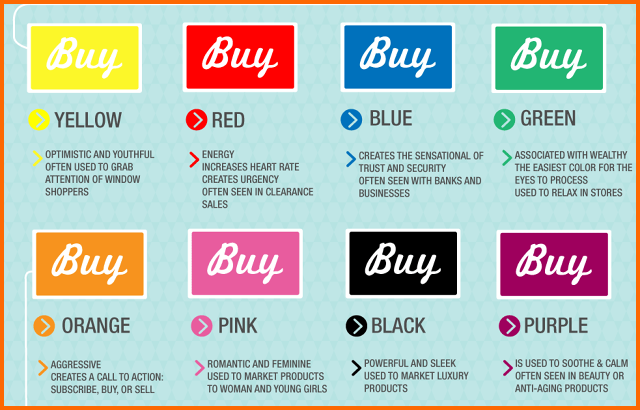
Check out this great infographic from Fast Company that can help you better understand what each colour means when it comes to colour psychology and purchasing behaviour!
When it comes to colour, make sure that your creative packaging not only looks great, but that it has meaning that customers can connect with. And when you decide to take advantage of the psychology of colour, make sure that you go with a packaging company that can offer you the highest quality printing that will not dilute or dull the colours you have carefully chosen. Go with pre-print rather than post, as it is more vibrant, brighter. Colour means something, so your colour needs to be the best it can!
When it comes to colourful creative packaging, Packaging Technologies Inc. has you covered. Contact us today to get a design started that will garner real results: 1-800-303-5883.